
Lazy Hare Bites
Visual Identity
Lazy Hare Bites was first established in 2022. It was founded in Torbay, in the South West of England. A family run business, that set out to create a variety of artisian homemade savoury and more recently, sweet treats. The brand focuses on farm-shop style treats made from quality and luxurious locally sourced ingredients including meat and dairy products, vegetables, fruits and chocolate. Its targeted mainly at festival goers, the farming industry, local bakeries and suppliers, and those who enjoy the finer things in life.
Challenge & Solution
The Director of the brand had a vision, and wanted to upscale the business but was unable to do so without professional branding. The client's branding at the time featured a template based logo created with the logo maker in vistaprint. The logo did not allow for different version for different design and print mediums, was dated and just looked poorly put together and was not represenative of the luxurious feel the client was aiming for. The client was selling at local fayres, fates and festivals including The Devon County Show. It was here where the brand was spotted by a major retailer, who asked if the client would be interested in pitching his business to their head honchos. However, the client was advised to develop his branding and visual identity before doing so, to be in with a chance of stocking his products on the shelves of the major retailer's stores. The client gave me the brief that he really wanted the brand to ooze luxury, class and professionalism. He wanted to include in some way that the brand was established in Devon, and wanted a rustic feel to the overall branding.
Final Result
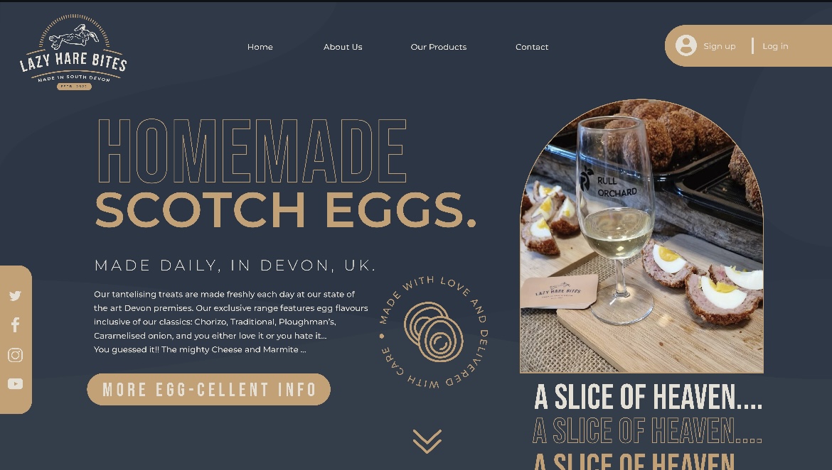
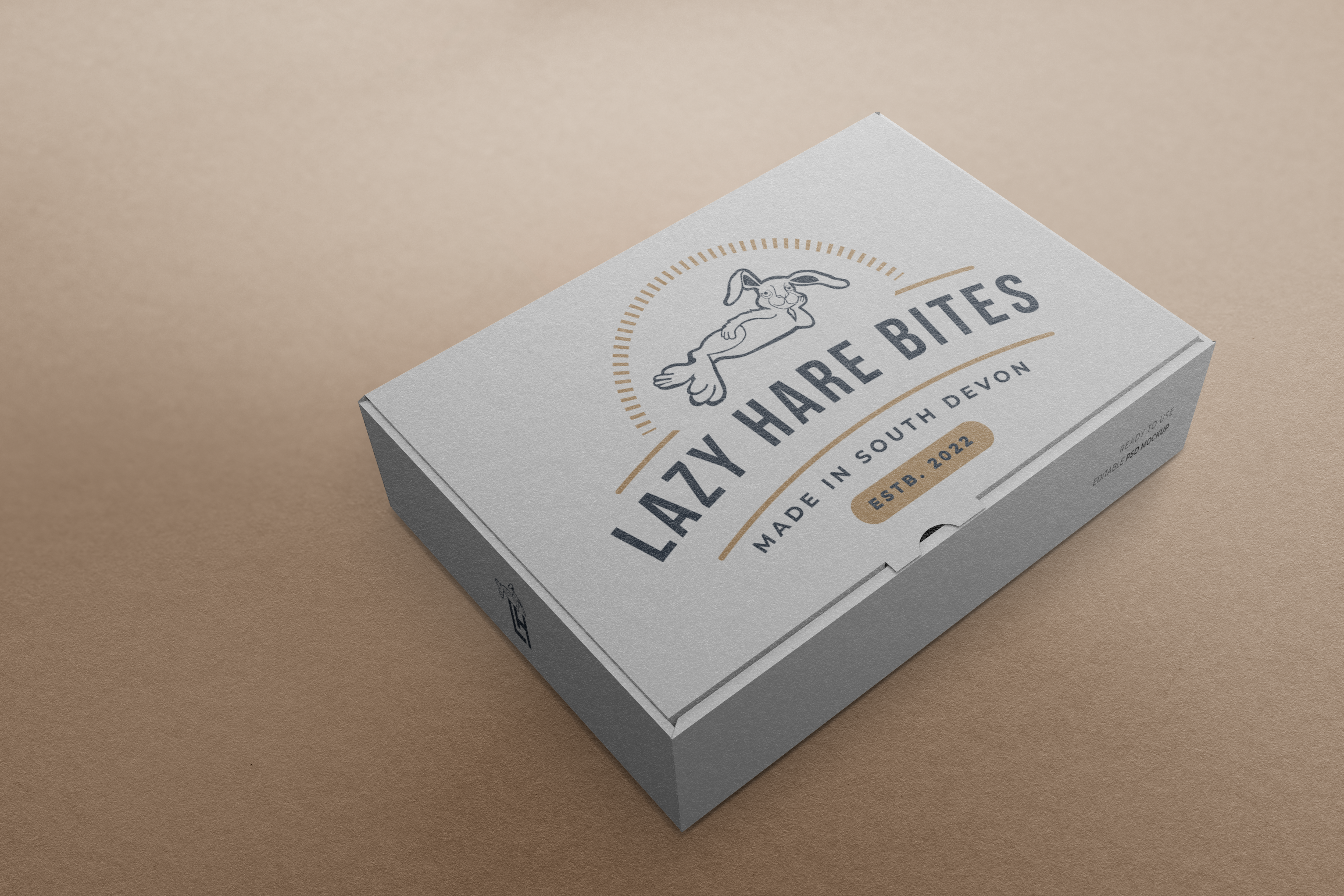
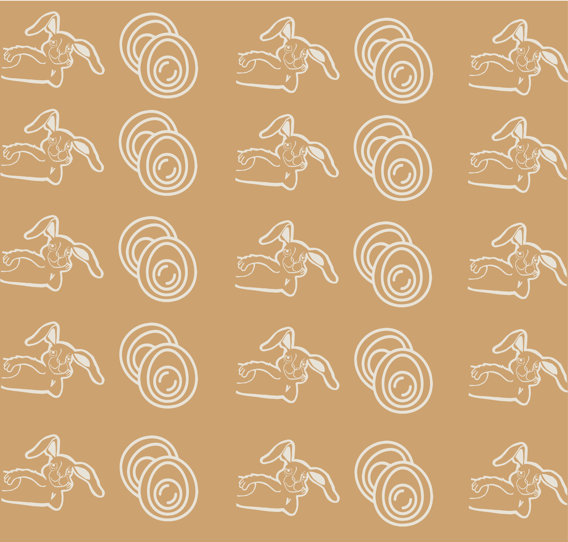
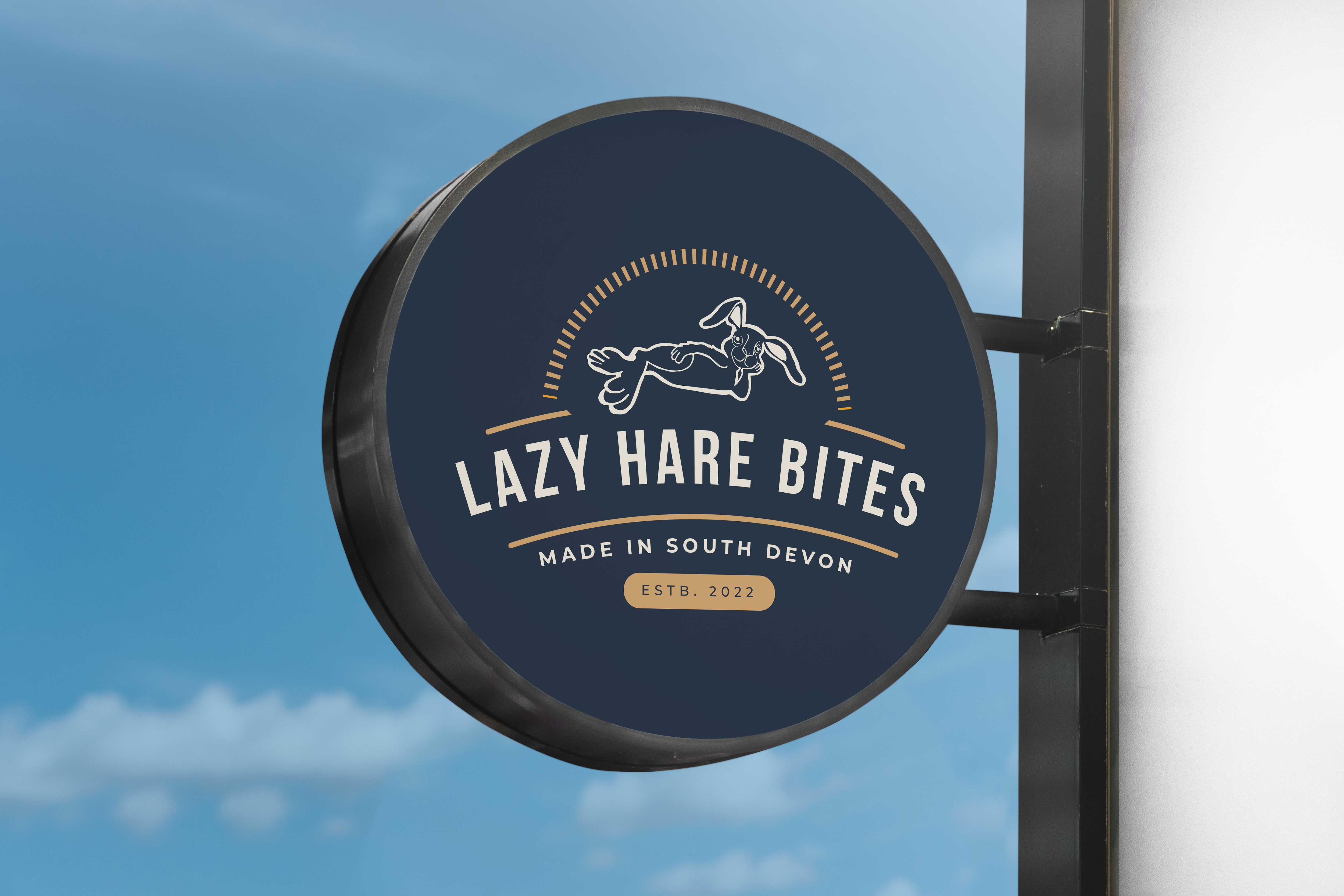
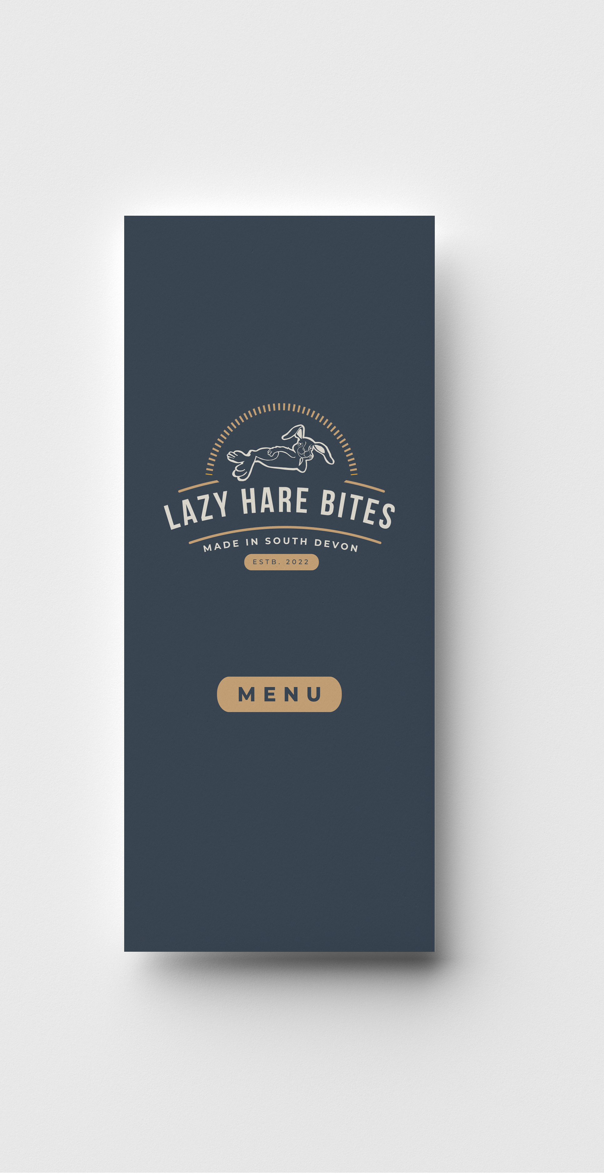
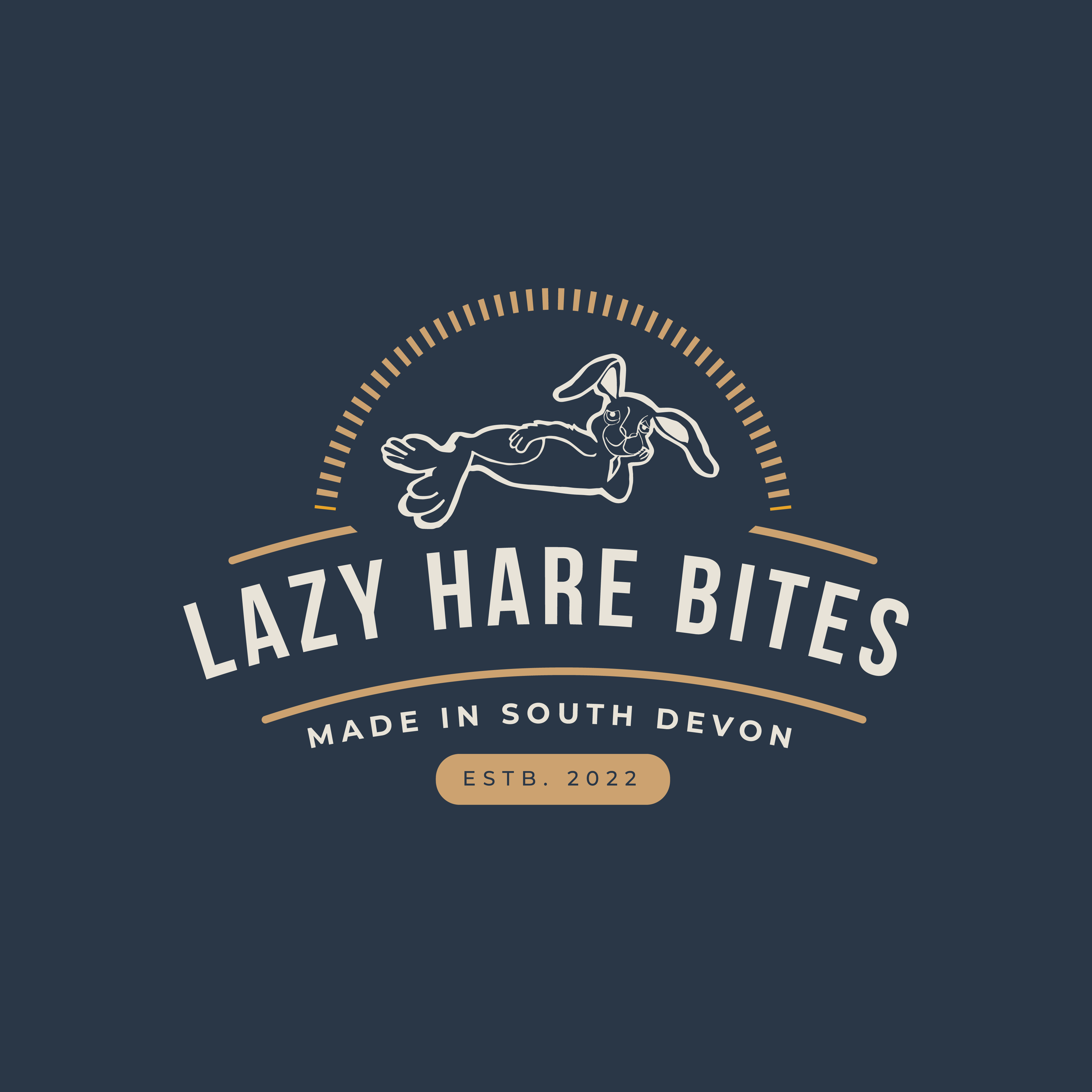
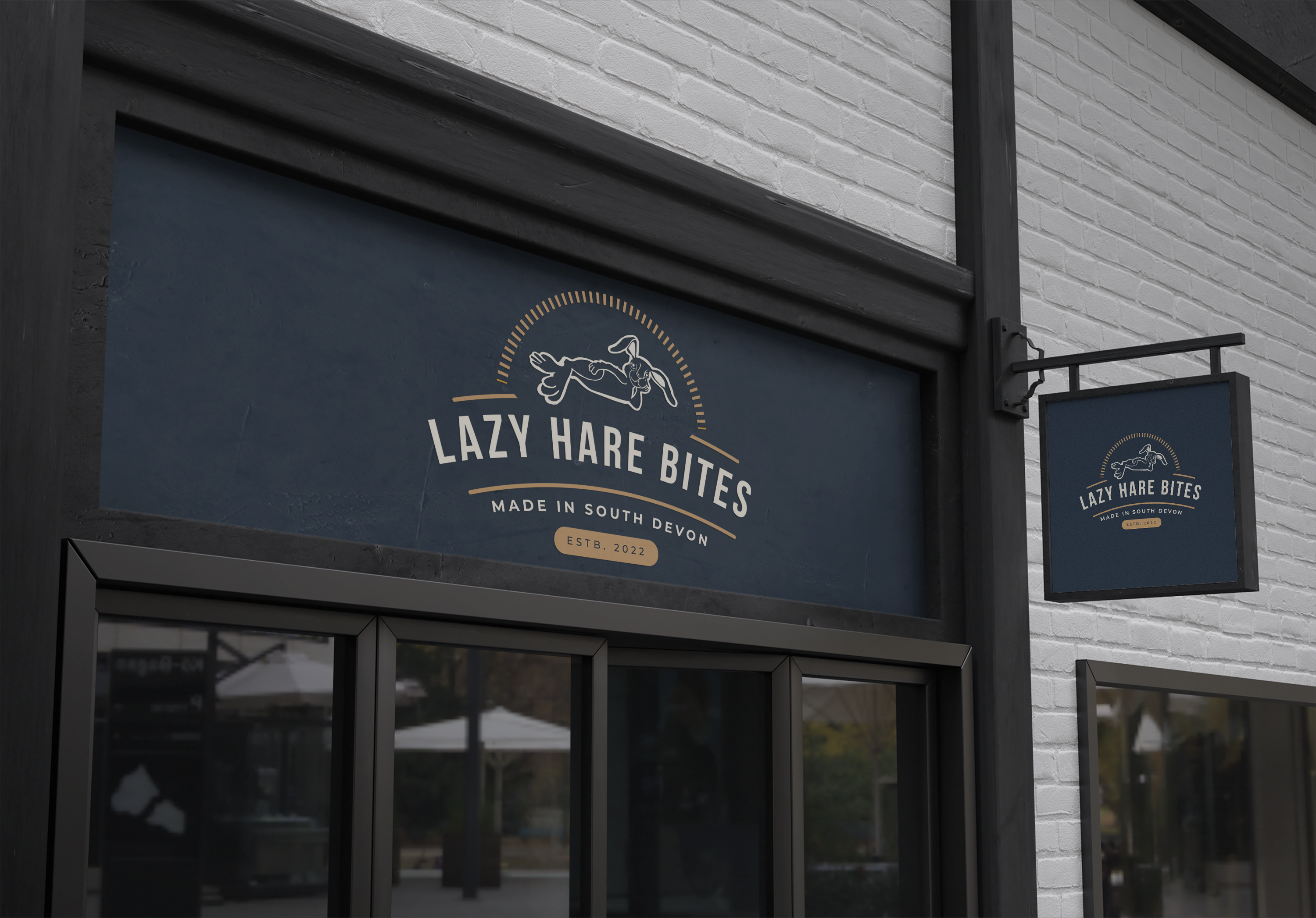
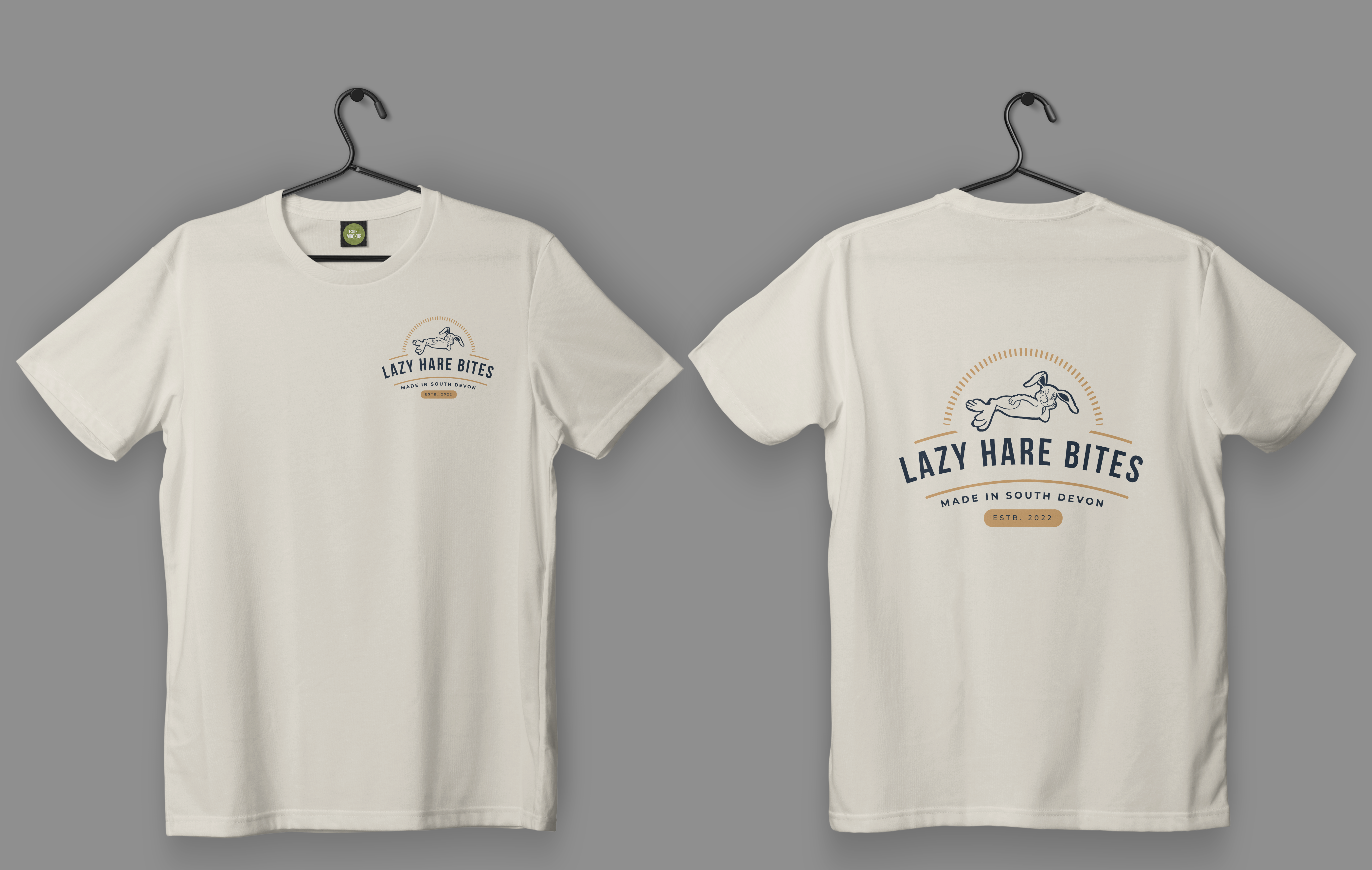
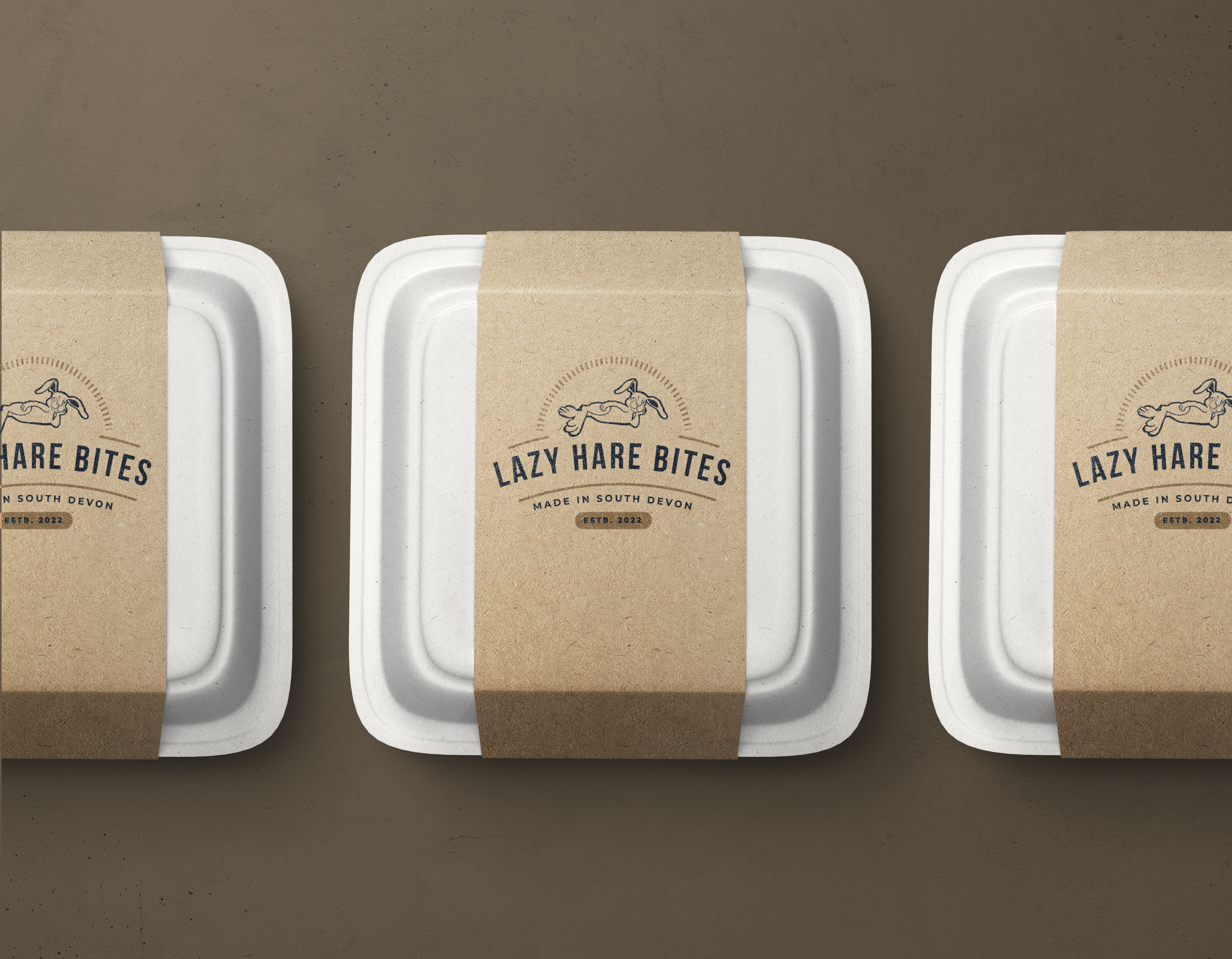
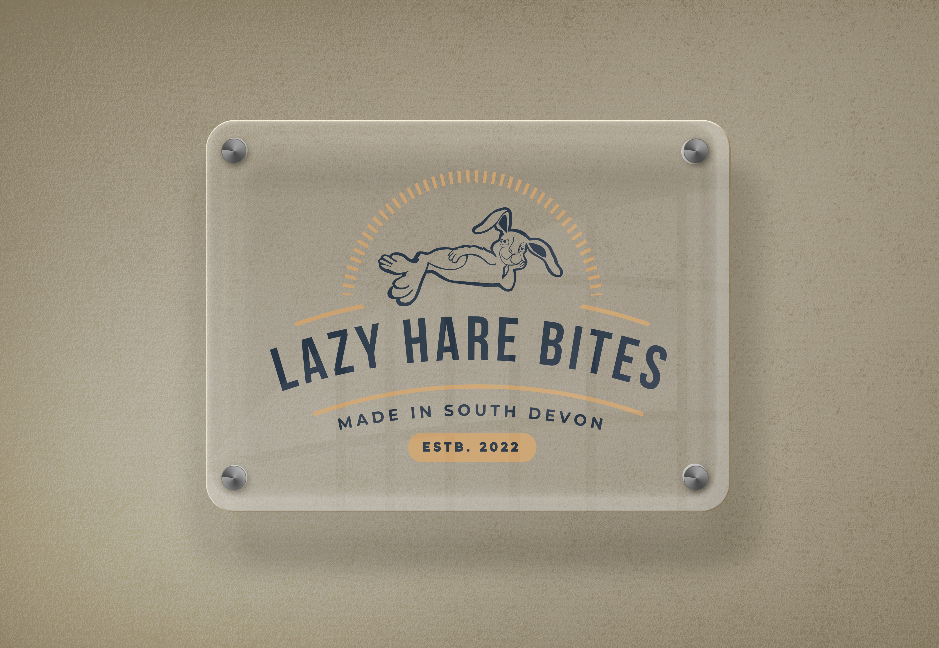
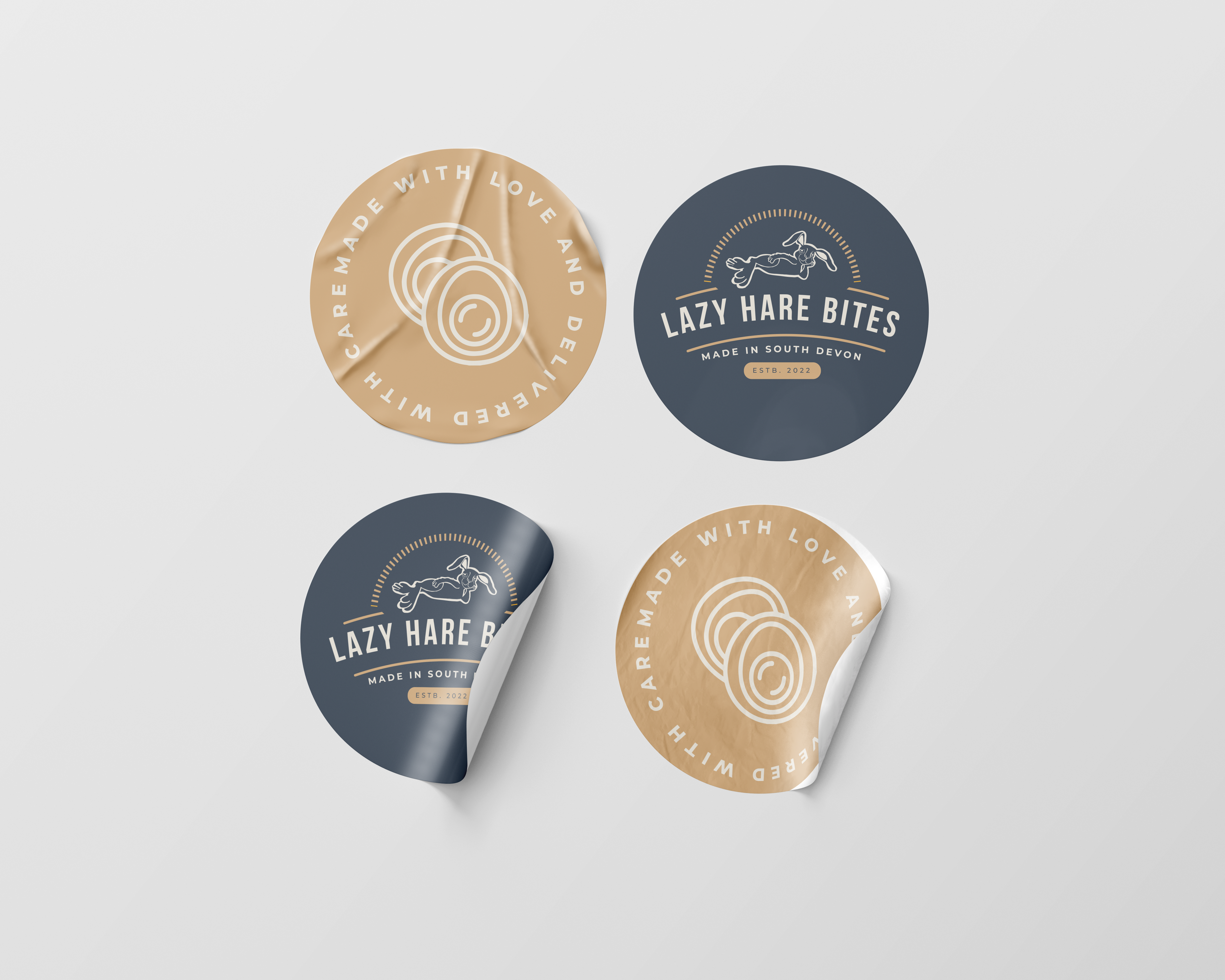
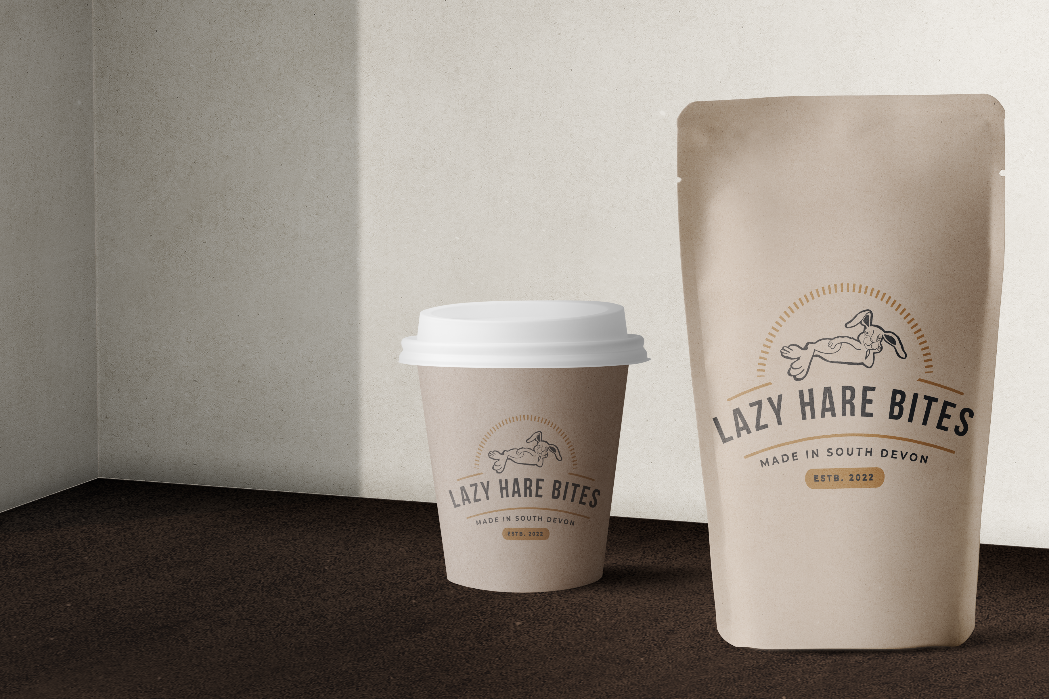
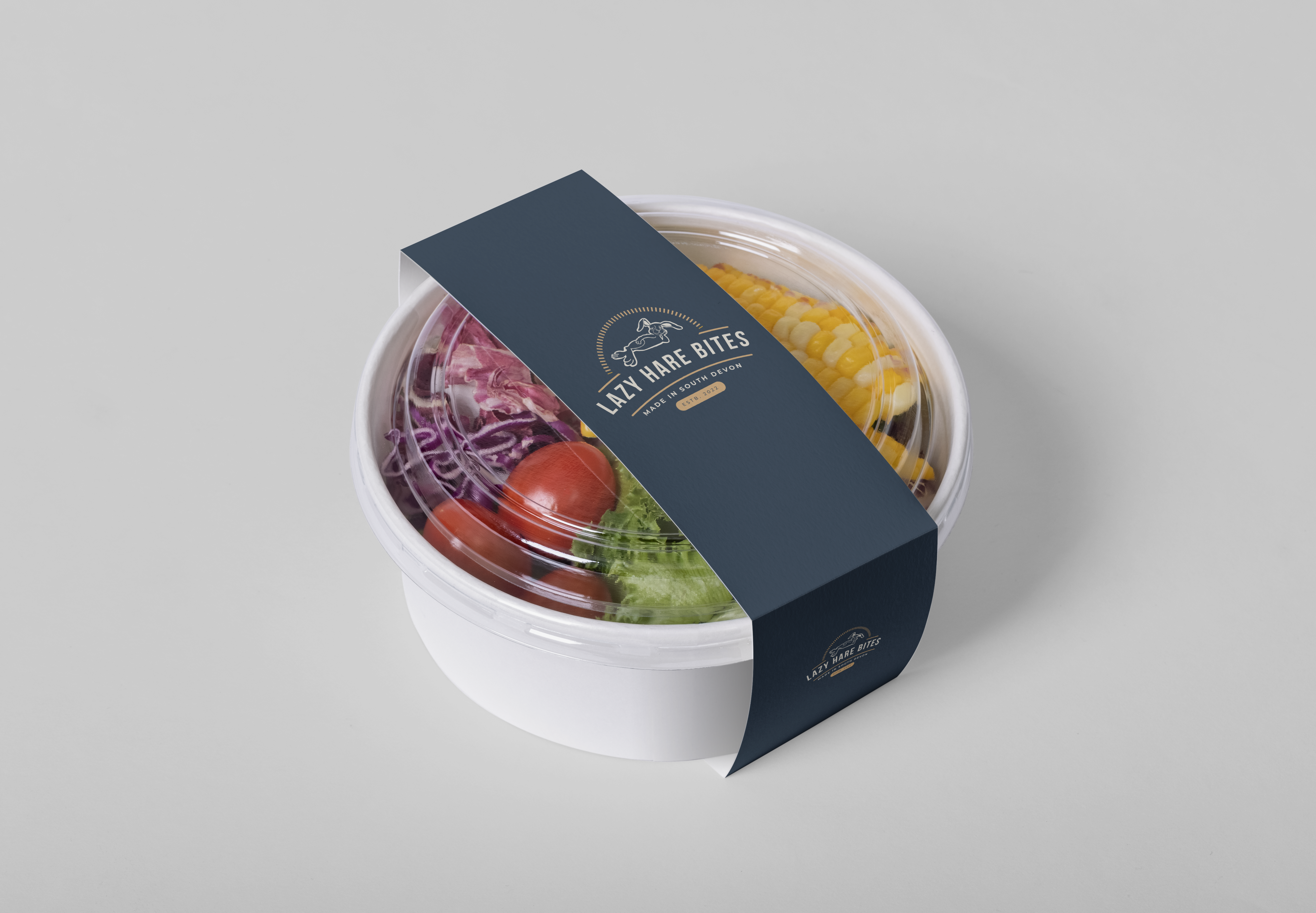
We took on board the client's instructions and created a branding pack, complete with a bespoke website design. The primary logo was created based on a garden statue the client was very fond of and had requested to be incorporated into the brand. We opted to go for a badge style logo for the primary logo, including the location where the brand was established as this was of high importance to the client. The colour palettes both primary and secondary consisted of a variety of luxurious colours, including a navy blue, and 18 carrat gold. We chose a modern, yet sophisticated font as the primary font, using Bebas, and the secondary font, to compliment the primary was an old favourite, the sleek Montserrat Thin. We also created a bespoke website design, opting for a sleak, clean design, user friendly and easy to navigate. The client stressed the importance of simplicity in this aspect, and the functionality of the website, so we created a website in line with the brand guidelines with that very idea in mind.
Category:
Hospitality - Food Vendors.
Software:
Adobe Illustrator
Adobe Photoshop
Service:
Branding and Web Design
Client:
Lazy Hare Bites
Date: