Bonk Building:
Visual Identity
Challenge & Solution
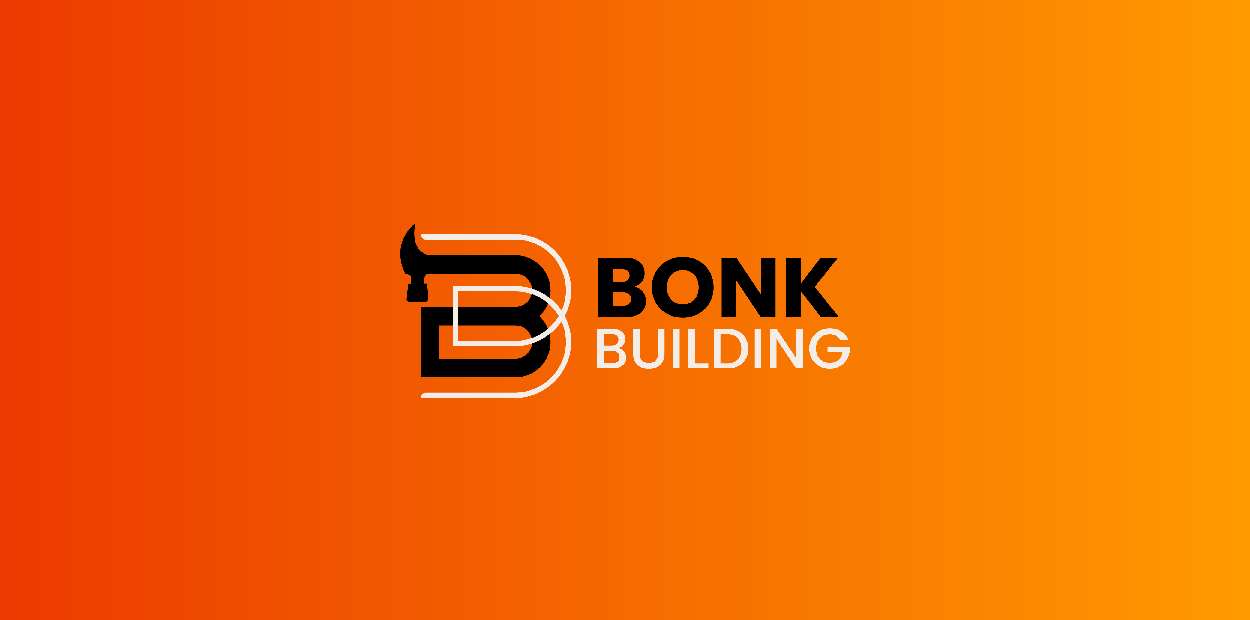
Bonk Building is a construction company based in South Wales, UK. The company name has recently been updated and as such the client wanted to go for a complete rebrand and refresh. Previously the client was working with business partners, but recently made the jump to start business by themselves. The client wanted a unique brand, but wanted it to be obvious from the logo that it was for a construction company. The client didn't want to logo to focus on a particular aspect of building works, but rather general building works as the client wanted to stress that all aspects of building work were on offer for potential customers, despite being a plasterer by trade. He felt his previous logo put off potential customers by focusing on the plastering side of things. He wanted the logo to be bright, and representative of the fact that the new company was named to honour the memory of a special person without taking anything away from the business itself. The client wanted the branding to be bold, in order for him to be able to establish himself quickly, and separate himself from his previous business. "I just wan't something that does what it says on the tin.'
Final Result
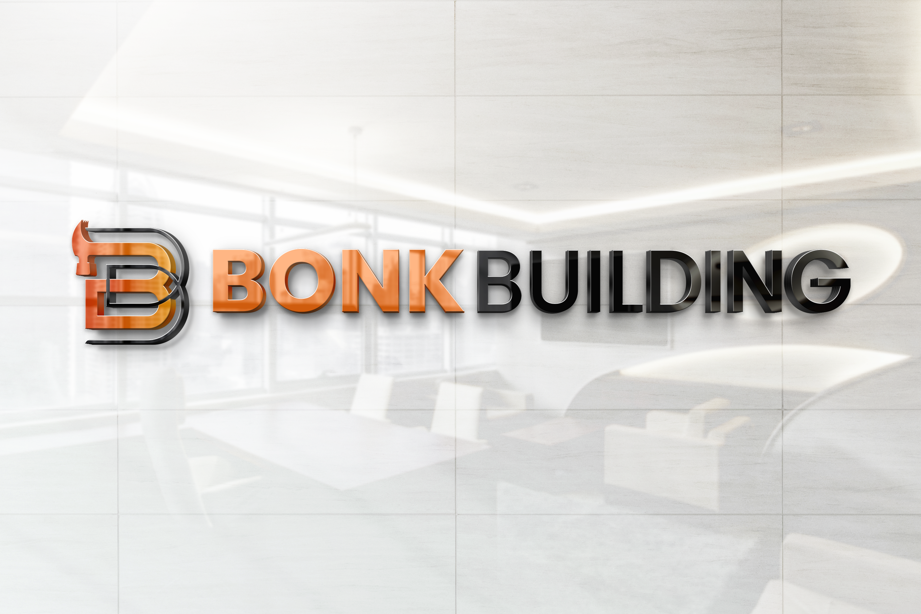
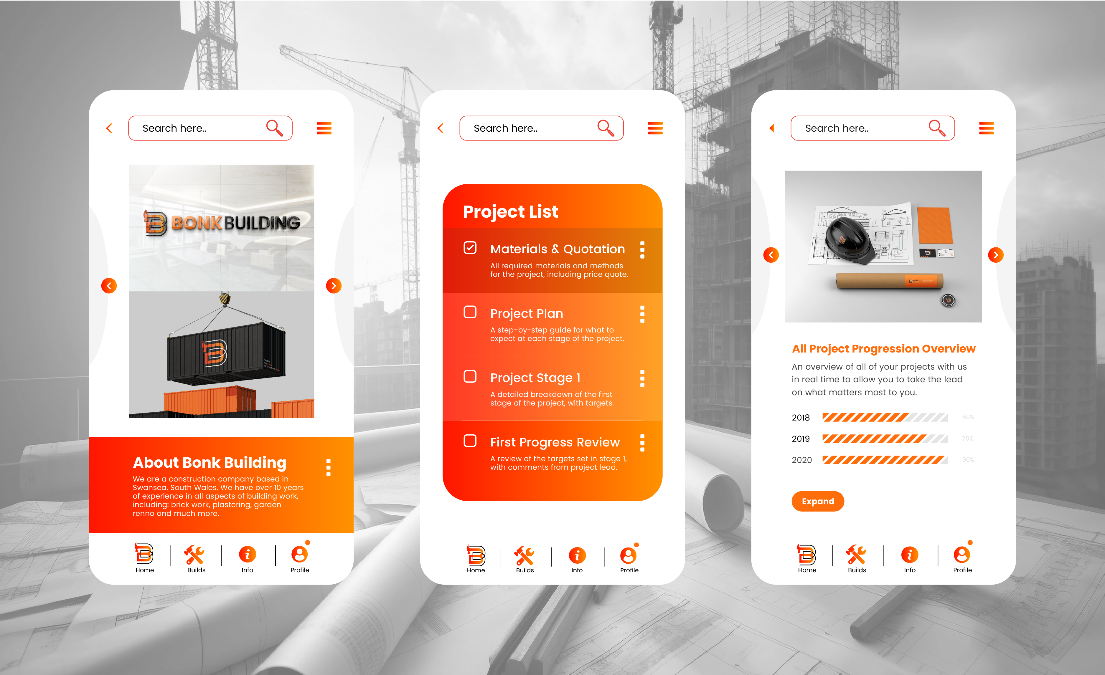
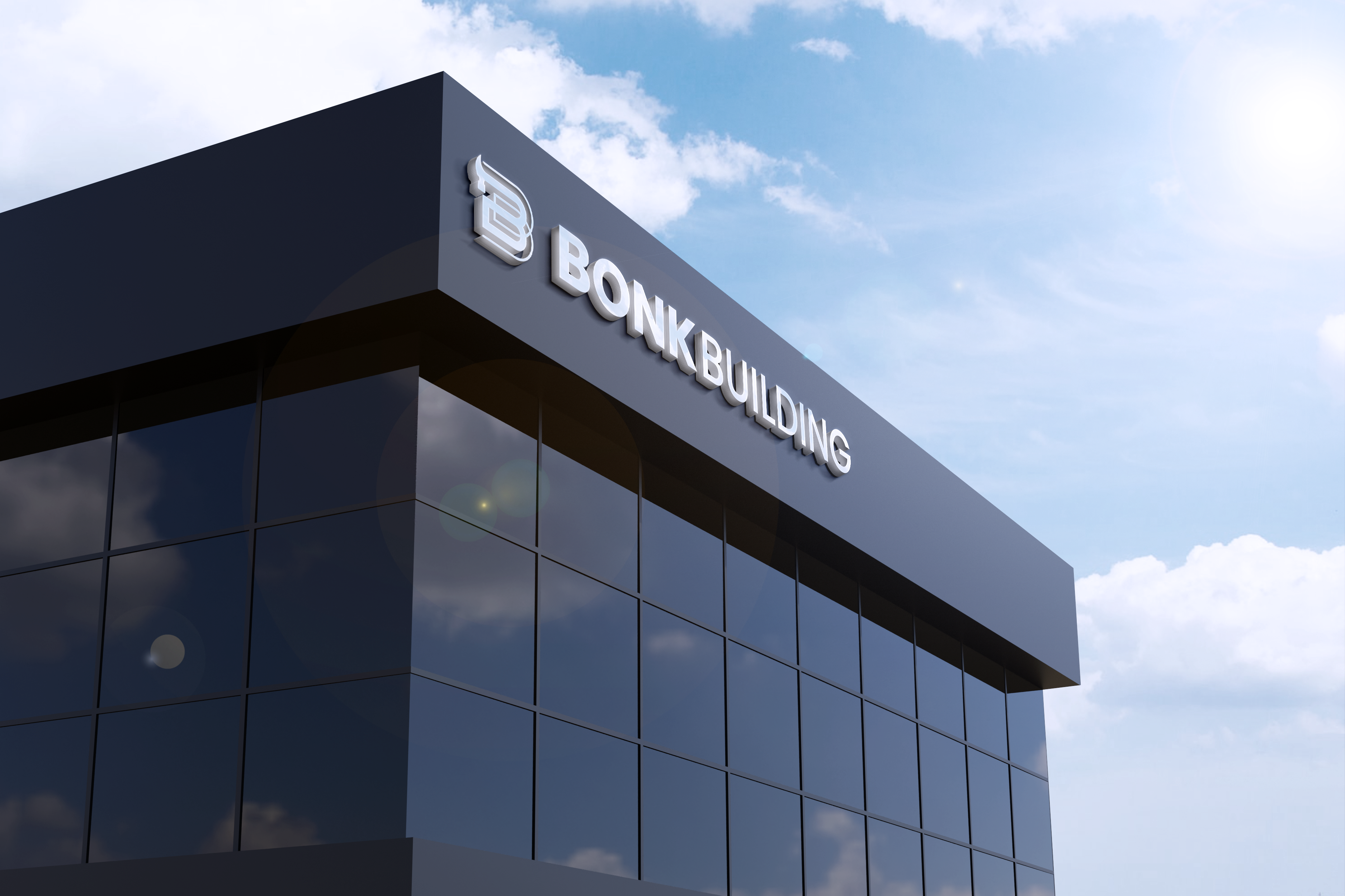
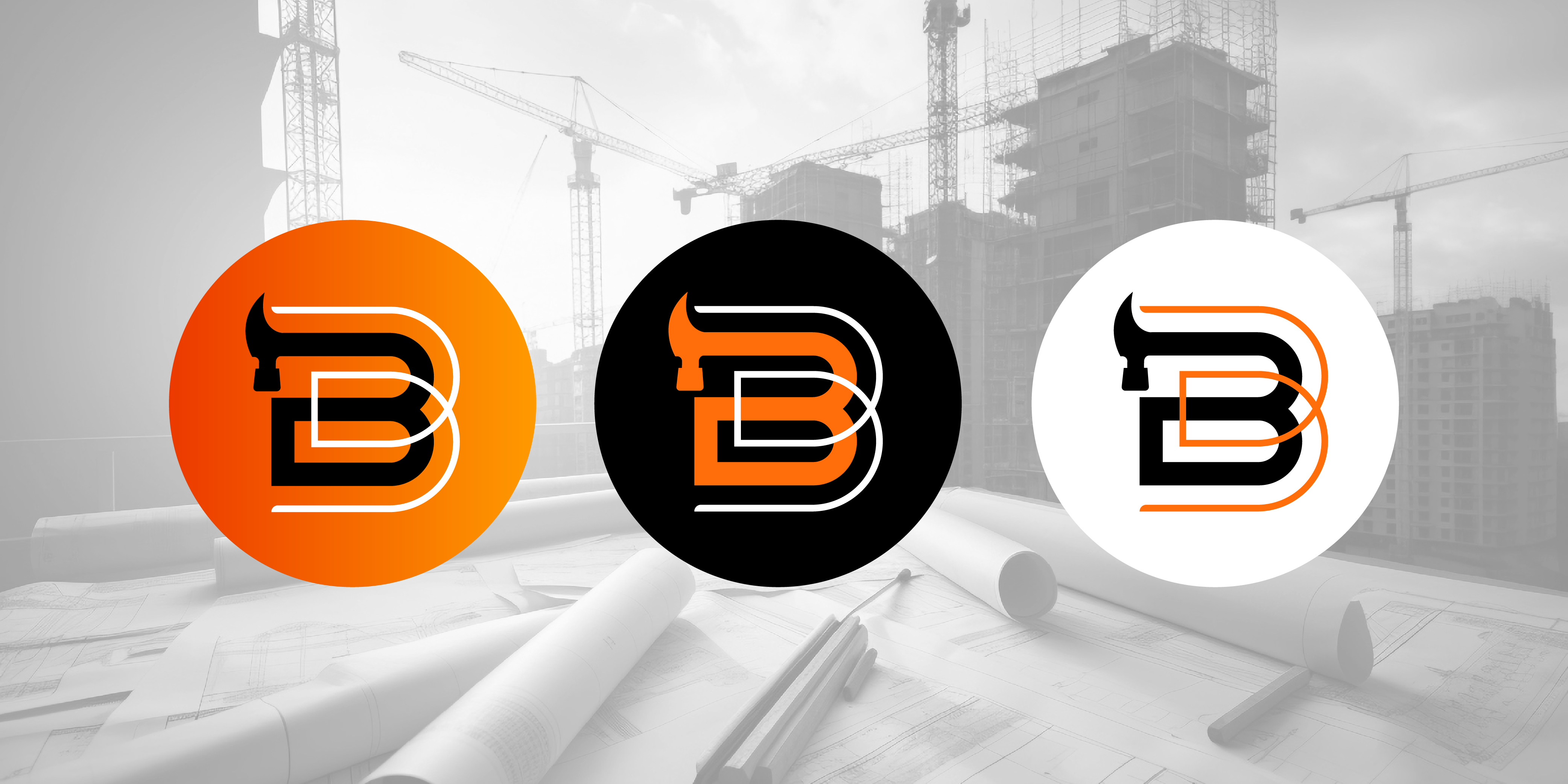
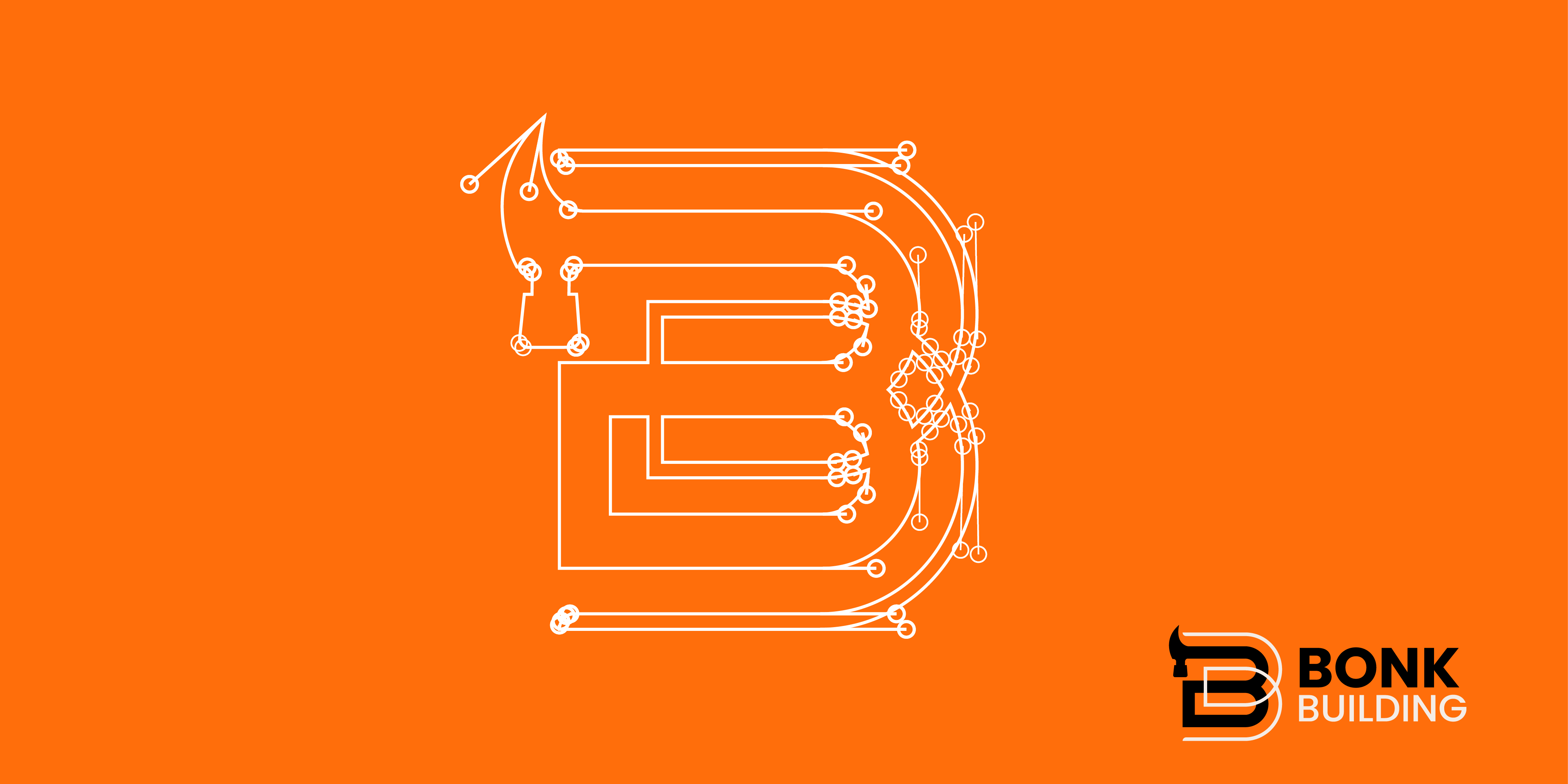
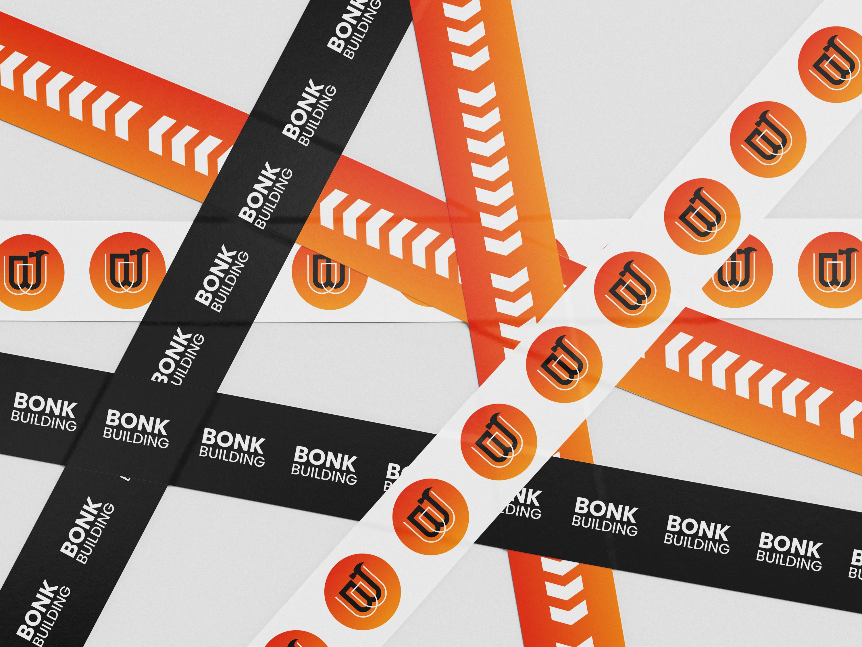
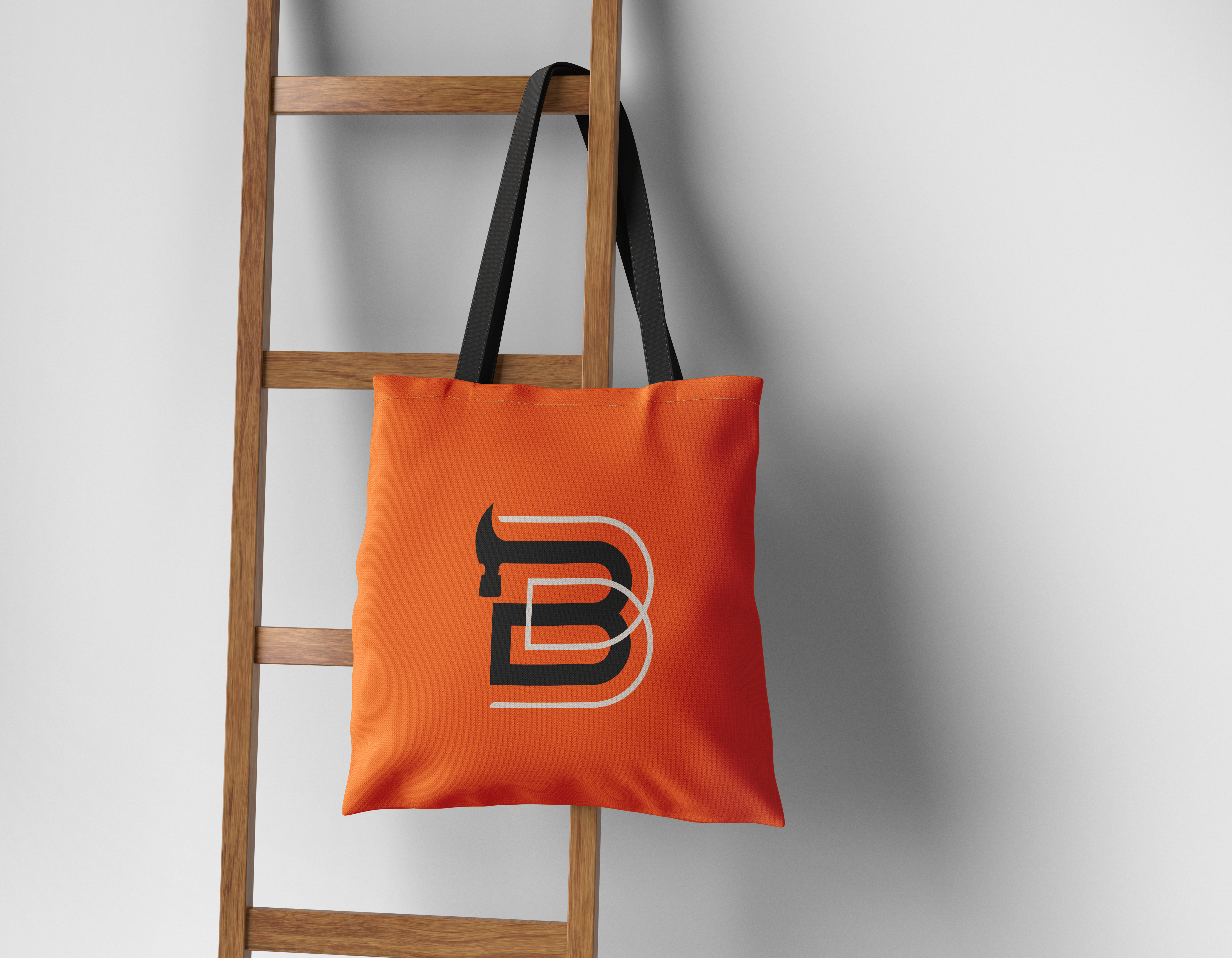
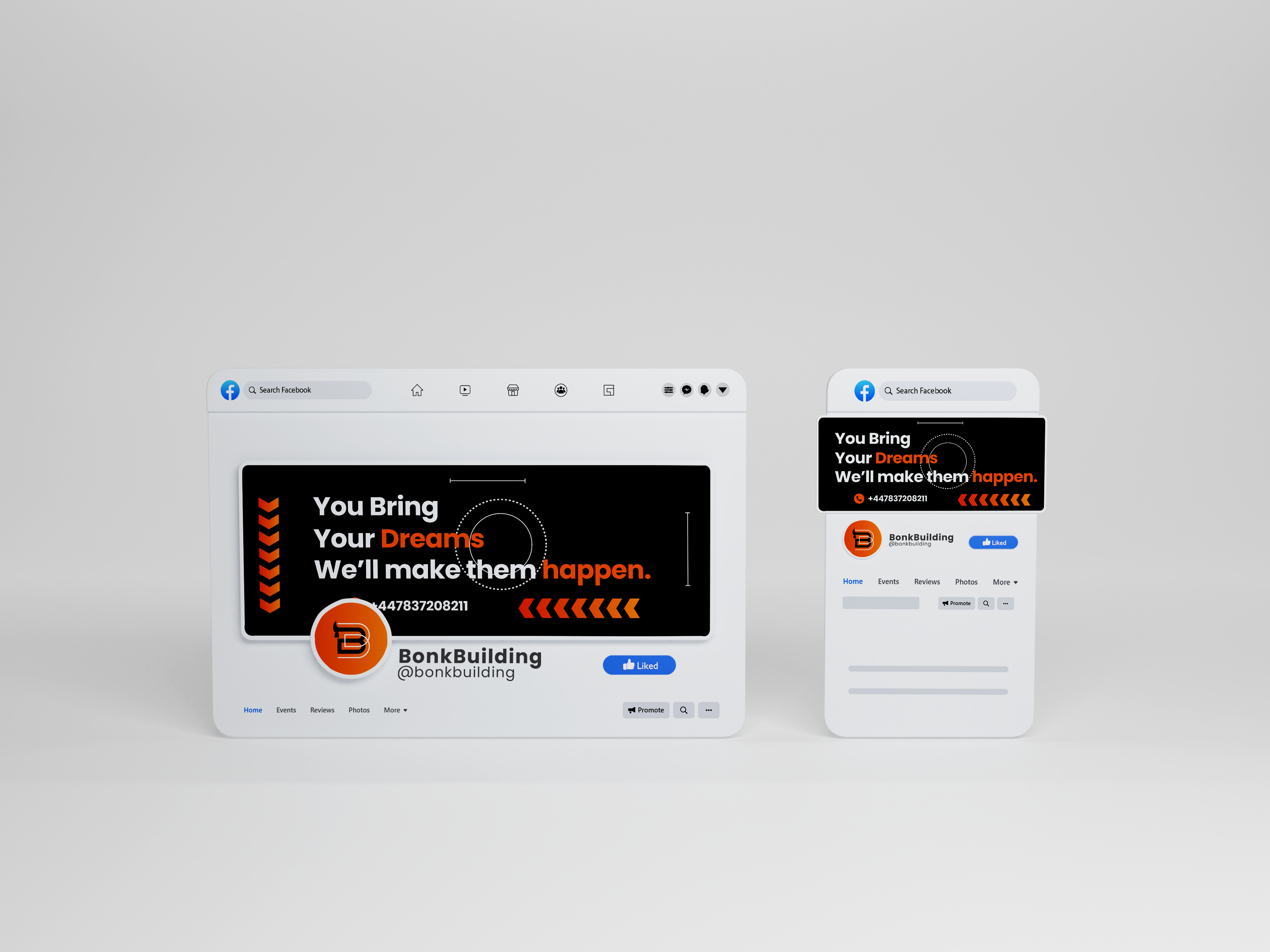
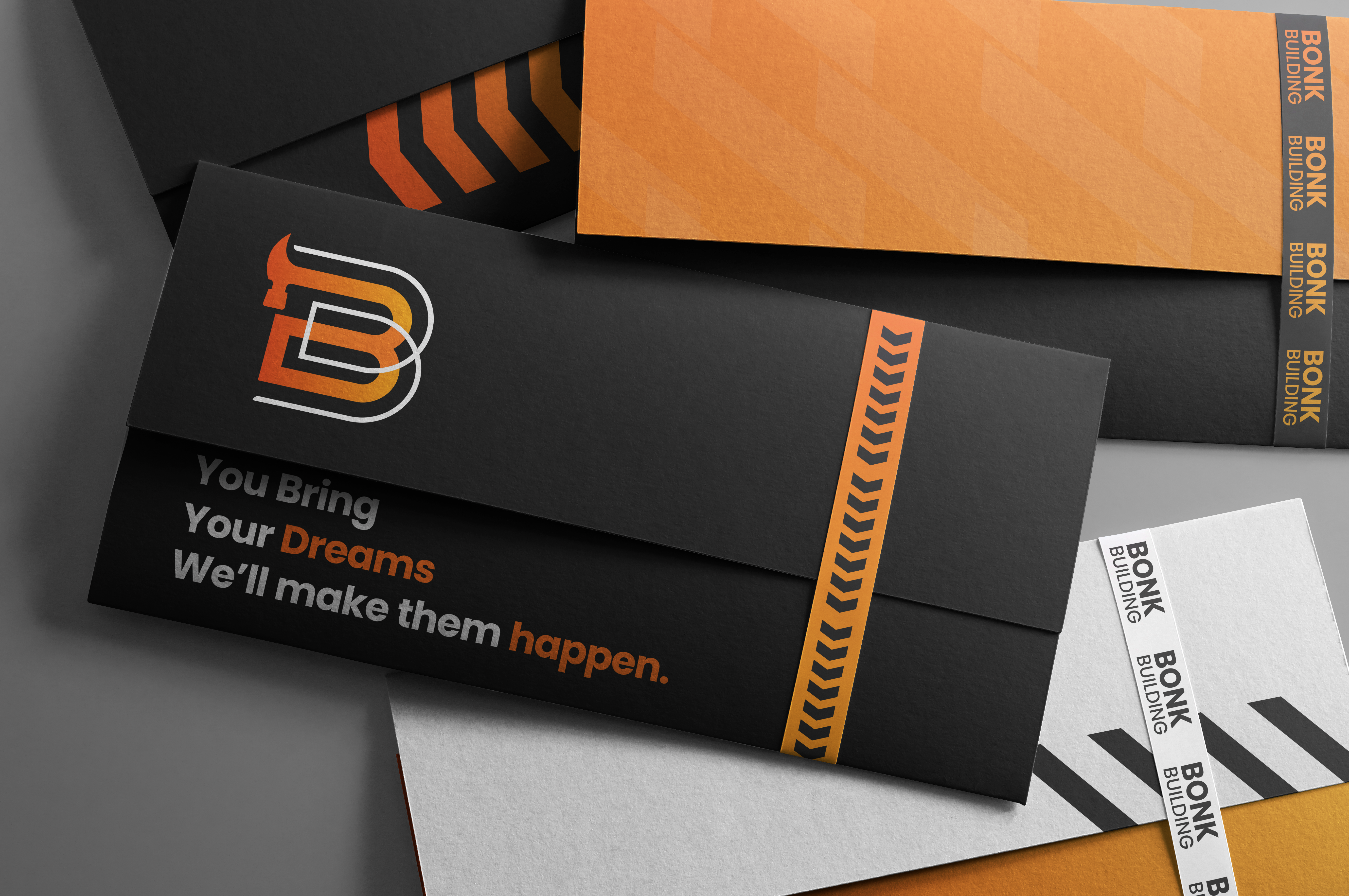
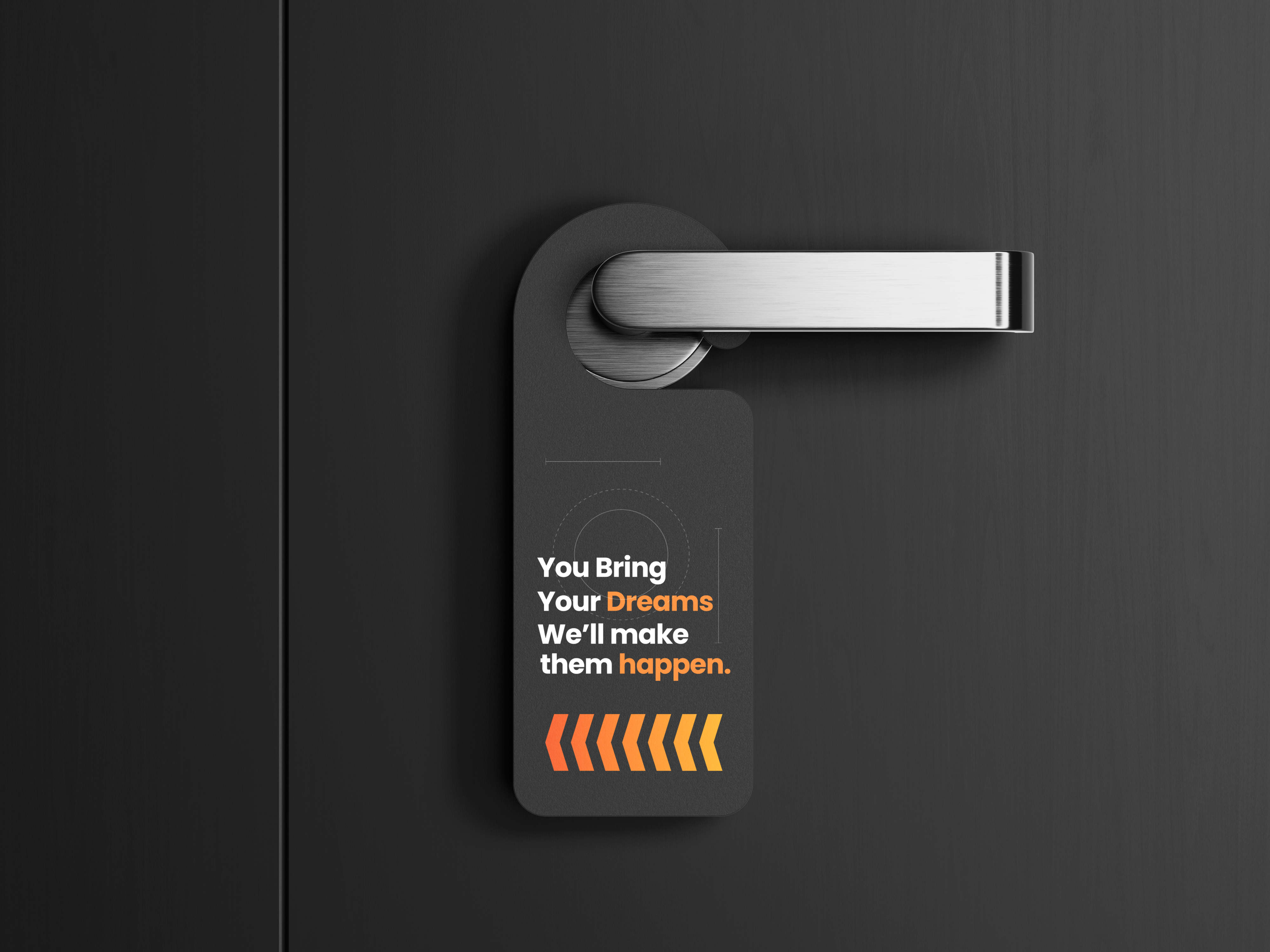
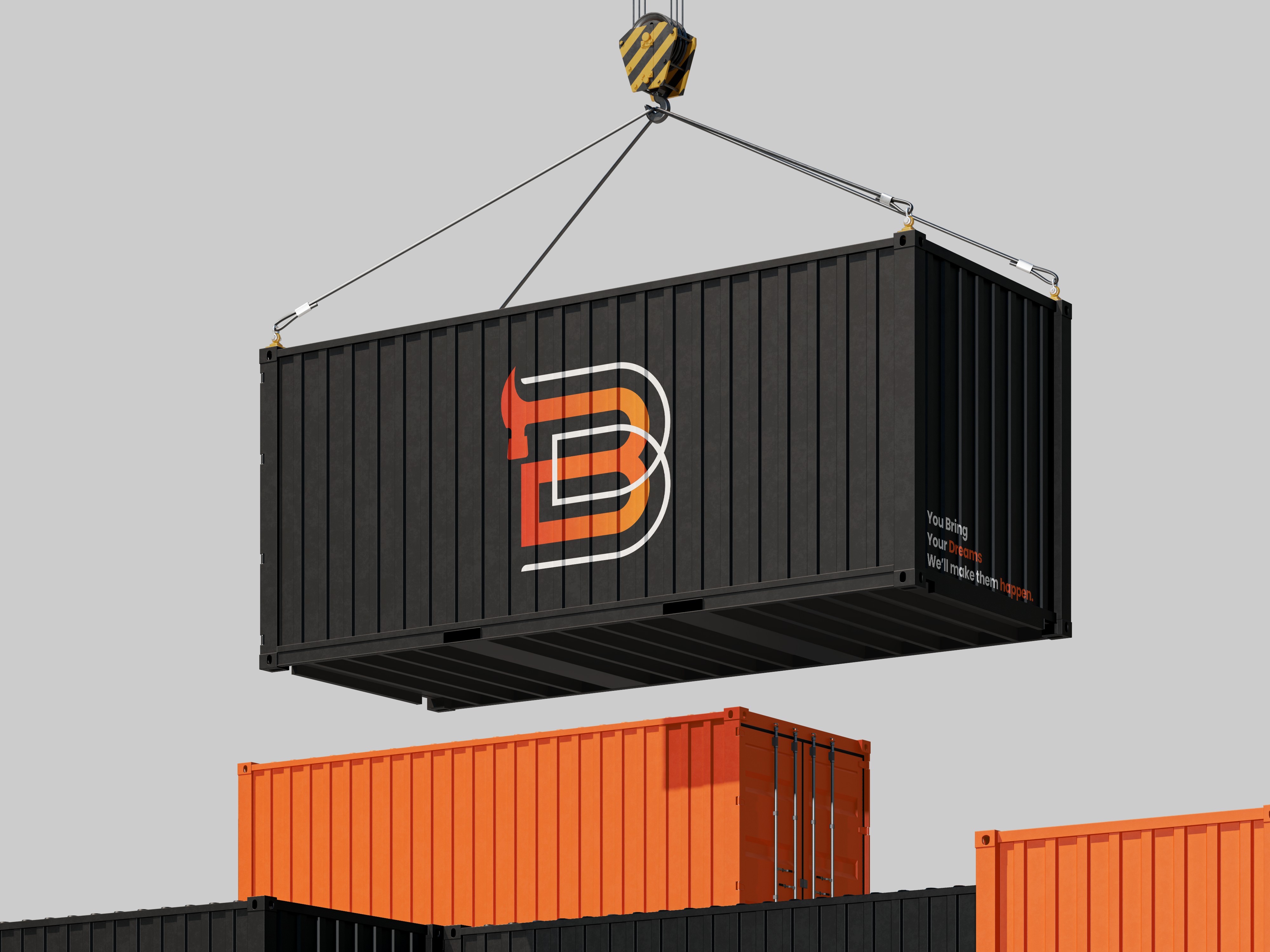
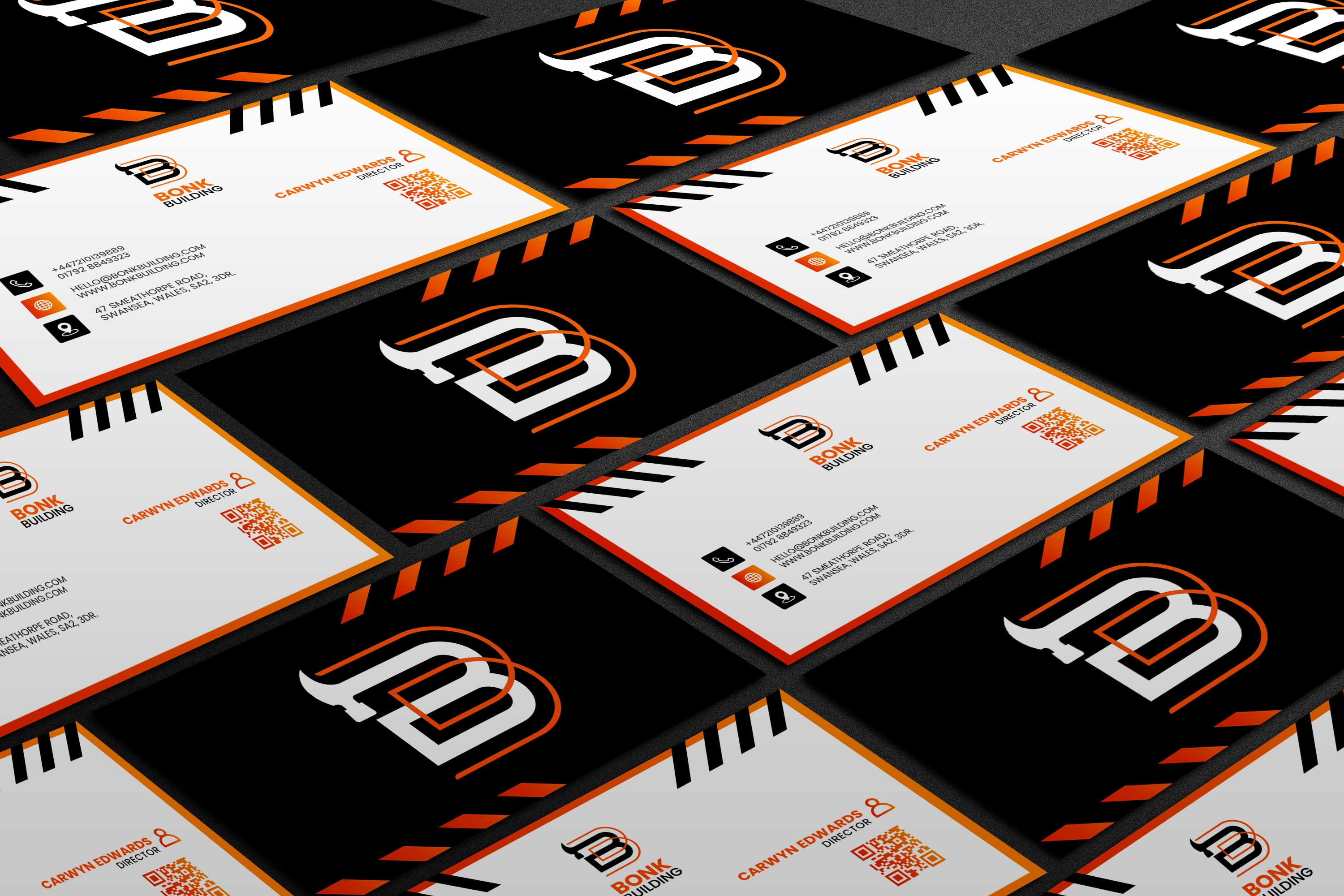
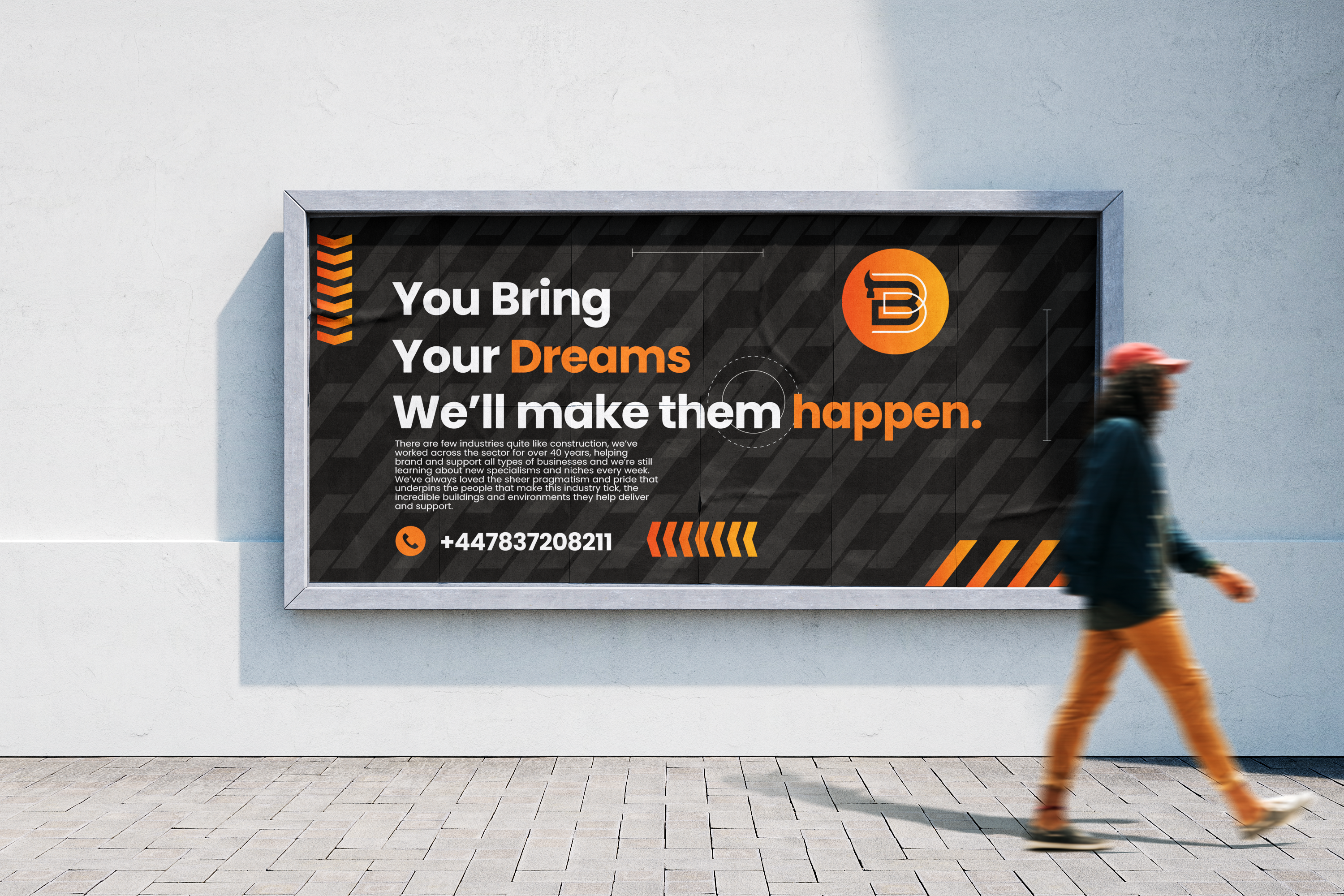
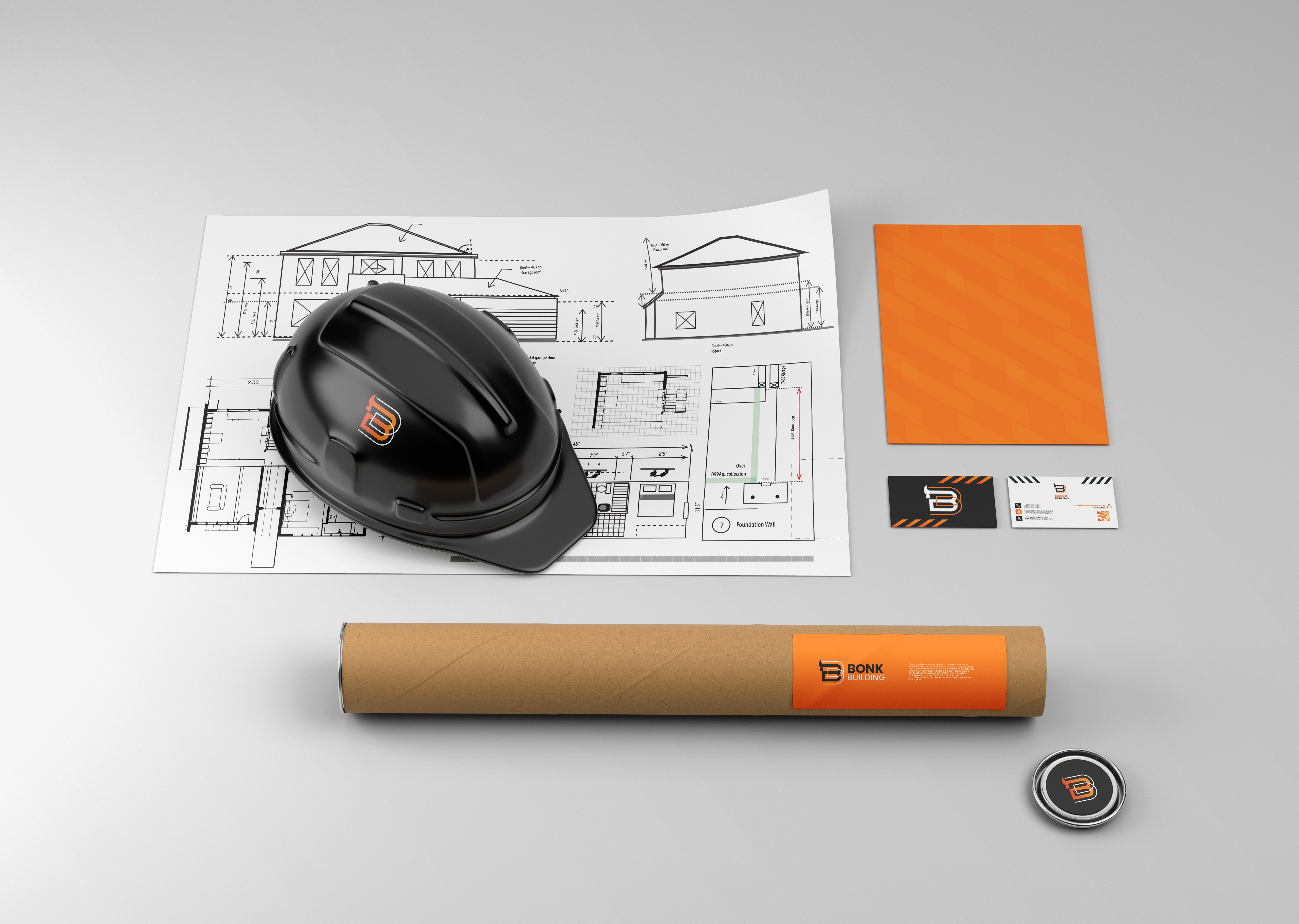
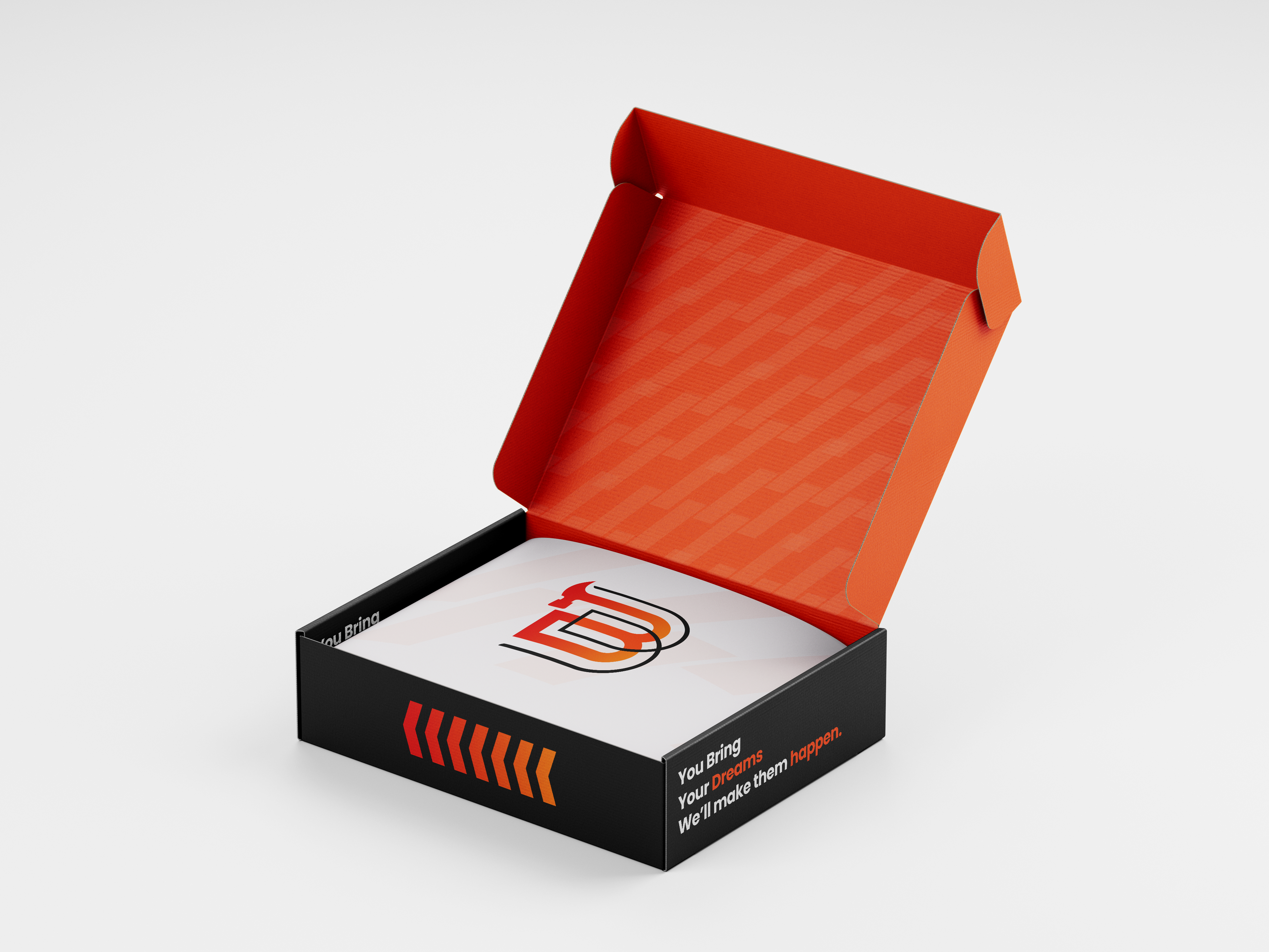
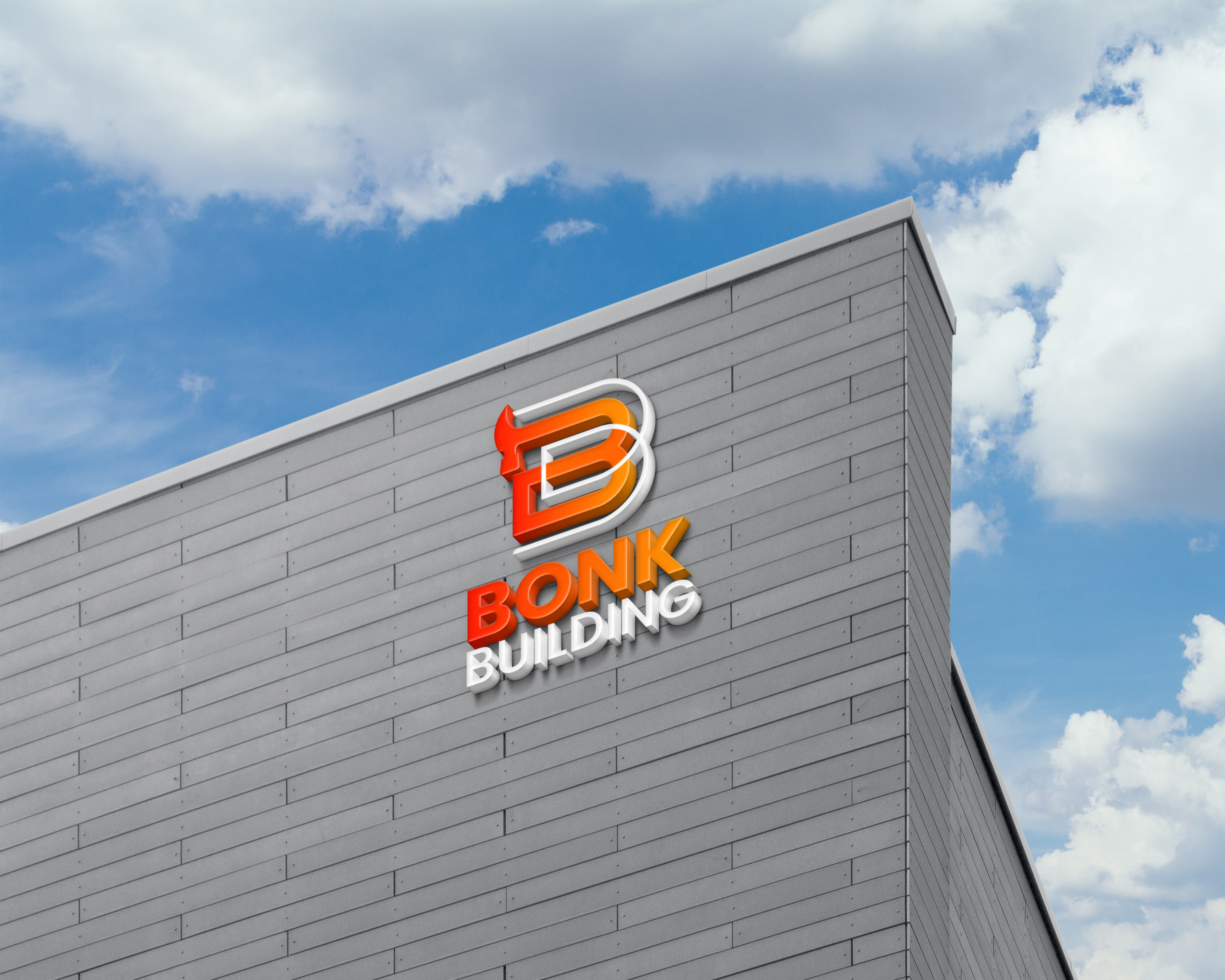
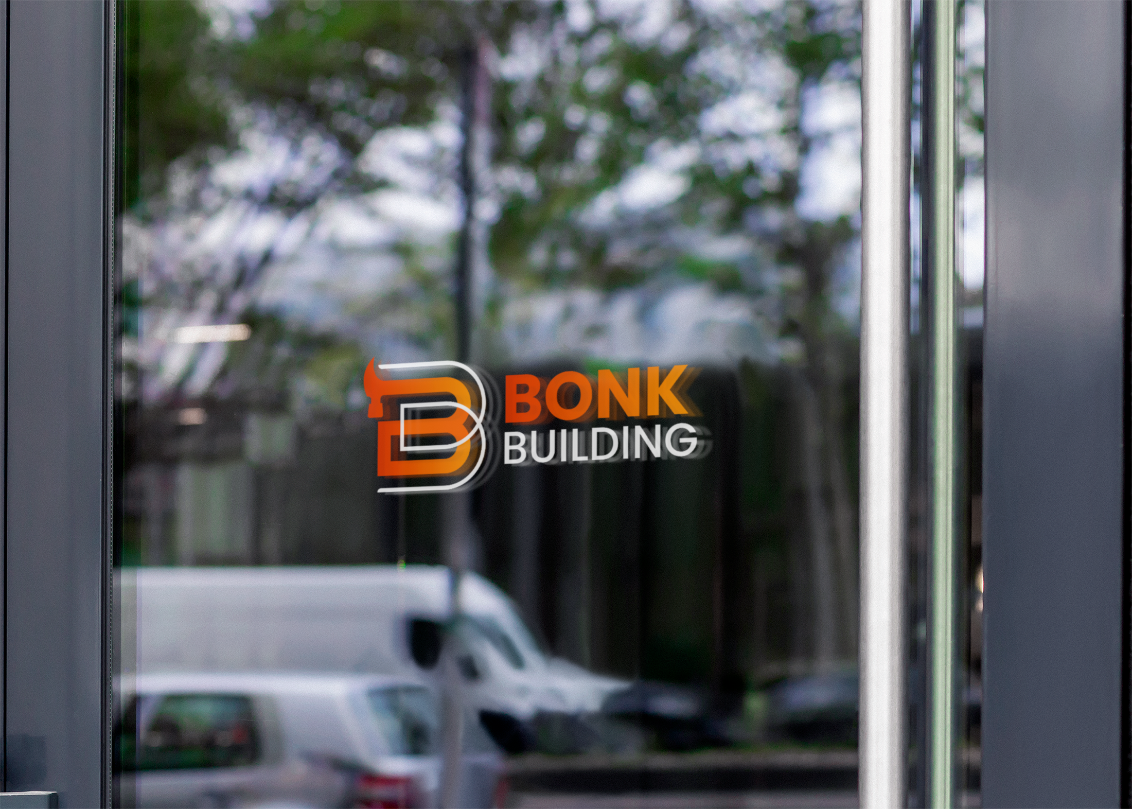
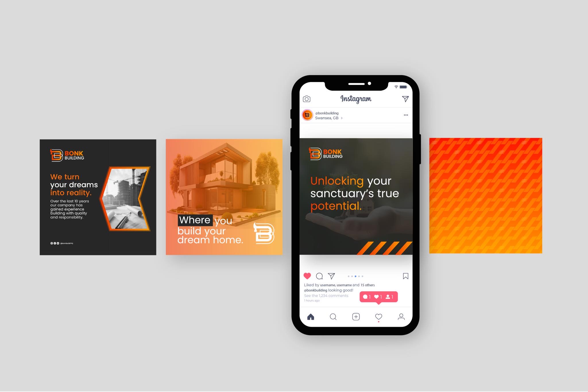
Clean, modern and bright branding complete with wordmark, submark, horizontal and vertical logos, stickers, and two brand patterns. We also supplied the client with brand guidelines featuring primary and secondary fonts, logo padding and sizing, and a primary and secondary colour palette. We also included both digital and print usage of the logo so that the client was able to visualise the finished product on a range of appropaite mediums.
Category:
Construction
Software:
Adobe Illustrator
Photoshop
Service:
Branding
Client:
Bonk Building
Date:
